Tidyverse
The Tidyverse is a set of inter-compatible packages that are used throughout data science. The Tidyverse provides powerful tools that allow us to quickly `tidy’ data into data frames, transform the data, and then visualize it. This will then allow us to produce models. Throughout this report we will explore a real dataset found on Kaggle.
Pipes
The pipe operator %>% is provided by the magrittr R package. Pipes are a powerful tool that allow us to clearly express a sequence of operations. It may be intuitive to read the operator %>% as ‘piped into’. Thus we would read a_R_object %>% a_function as ‘a R object is piped into a function’. The general idea is that g(f(x)) can be rewritten as x %>% f %>% g. This is particularly useful when we are transforming data and want to sequentially make changes. Below we write two versions of the same code, one which uses pipes and one which uses traditional R programming.
First we import the tidyverse.
library(tidyverse)# setup
par(mfrow=c(1,2))
x <- seq(0,10, length.out=1000)
# normal R programming
plot(sqrt(abs(cos(x))))
# with the piping operator
x %>% cos %>% abs %>% sqrt %>% plot Note that in this case the piping operator is less clear. Note the y label in the above graph. It is
 . because the piping operator’s partial results are stored in .. We can also use the . to tell the piping operator where to pipe your variable into. For example, we may have a function with two inputs.
# function with two inputs
cust_add <- function(x1,x2) {
  return(x1+2*(x2))
}

# define a sequence
x <- seq(0,1,length.out = 10)

# pipe x into the second element of cust_add()
x %>% cust_add(1, .)
## [1] 1.000000 1.222222 1.444444 1.666667 1.888889 2.111111 2.333333 2.555556
## [9] 2.777778 3.000000# sanity check
cust_add(1,x) == x %>% cust_add(1, .)## [1] TRUE TRUE TRUE TRUE TRUE TRUE TRUE TRUE TRUE TRUEIt is worth noting that by default, the piping operator pipes into the first input of a function, so x %>% function(y) becomes function(x,y).
We now look at an example with the dataset UKload. An example with data is perhaps the best way to demonstrate the power of pipes.
data(UKload)
head(UKload)
## NetDemand wM wM_s95 Posan Dow Trend NetDemand.48
## 25 38353 6.046364 5.558800 0.001369941 samedi 1293879600 38353
## 73 41192 2.803969 3.230582 0.004109824 dimanche 1293966000 38353
## 121 43442 2.097259 1.858198 0.006849706 lundi 1294052400 41192
## 169 50736 3.444187 2.310408 0.009589588 mardi 1294138800 43442
## 217 50438 5.958674 4.724961 0.012329471 mercredi 1294225200 50736
## 265 50064 4.124248 4.589470 0.015069353 jeudi 1294311600 50438
## Holy Year Date
## 25 1 2011 2011-01-01 12:00:00
## 73 0 2011 2011-01-02 12:00:00
## 121 0 2011 2011-01-03 12:00:00
## 169 0 2011 2011-01-04 12:00:00
## 217 0 2011 2011-01-05 12:00:00
## 265 0 2011 2011-01-06 12:00:00Pipes make transforming the data via a sequence of operations simple, and easy to read.
# setup plot
par(mfrow=c(1,2))

# look at transformed data for lundi
UKload %>%
  subset(Dow == "lundi", select = c("NetDemand", "Posan")) %>%
  head(100) %>%
  transform(Posan = Posan * 365) %>%
  glimpse
## Rows: 100
## Columns: 2
## $ NetDemand <dbl> 43442, 50645, 48105, 49792, 51282, 47985, 46741, 50163, 4840…
## $ Posan <dbl> 2.500143, 9.500542, 16.500942, 23.501341, 30.501741, 37.5021…# lundi
UKload %>%
subset(Dow == "lundi", select = c("NetDemand", "Posan")) %>%
head(100) %>%
transform(Posan = Posan * 365) %>%
plot(NetDemand ~ Posan, data = ., ylim=c(33000,53000),
main = "Net energy demand on Mondays", xlab = "Day in year", ylab = "Net demand")
# samedi
UKload %>%
subset(Dow == "samedi", select = c("NetDemand", "Posan")) %>%
head(100) %>%
transform(Posan = Posan * 365) %>%
plot(NetDemand ~ Posan, data = ., ylim=c(33000,53000),
main = "Net energy demand on Saturdays", xlab = "Day in year", ylab = "Net demand")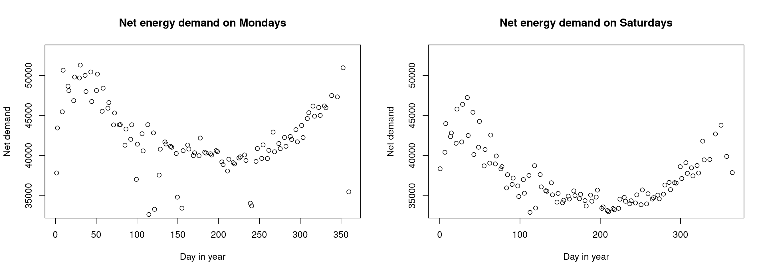
Advanced piping
There are other types of operators with specific properties. Note that you may need to import the library magrittr after importing the Tidyverse in order to use advanced pipes.
The assignment pipe %<>%
The operator %<>% works the same as the classic pipe %>%, but it also assigns the transformation to the original object. We can see this below.
x <- seq(0,1,length.out=5)
print(x)
## [1] 0.00 0.25 0.50 0.75 1.00x %<>% rev
print(x)## [1] 1.00 0.75 0.50 0.25 0.00The tee pipe %T>%
We may want to store the output of our sequence of operations. We can often do this via the assignment operator, but we often pipe our output into the plot function. In this case, we cannot use the assignment operator as seen below.
s <- seq(0,10,length.out=100)
s %<>%
  cos %>% plot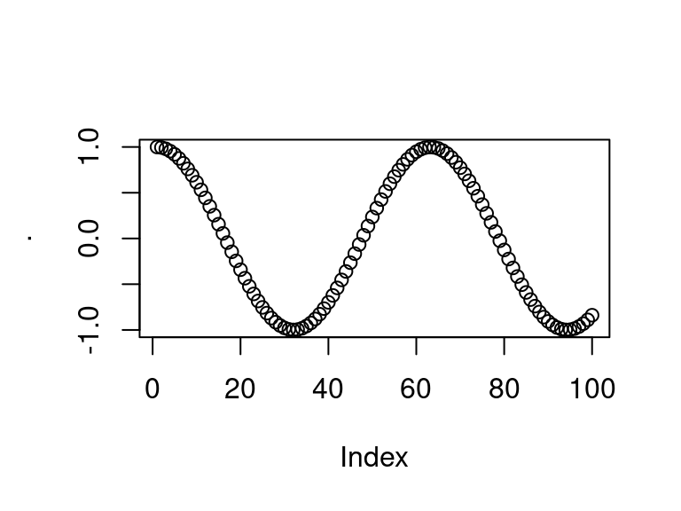
print(s)## NULLWe see that \(s\) is NULL. Instead we may store the output in the middle of a sequence of pipes by using the tee operator %T>% as seen below. We begin the pipe with the assignment operator <-. Note that \(s\) now stores the output of the \(cos()\) function.
par(mfrow=c(1,2))
s <- seq(0,10,length.out=100)
s <- s %>%
  cos %T>% plot
plot(s)
print(s[1:5])## [1] 1.0000000 0.9949028 0.9796632 0.9544366 0.9194801The exposition pipe %$%
When using pipes, we may encounter a scenario in which we want the names on the left hand side of the pipe to be easily available to the right hand side. This is what the exposition pipe does. This is particularly useful when working with named data and lists. Below we work with the UKload dataset for an example.
head(UKload)## NetDemand wM wM_s95 Posan Dow Trend NetDemand.48
## 25 38353 6.046364 5.558800 0.001369941 samedi 1293879600 38353
## 73 41192 2.803969 3.230582 0.004109824 dimanche 1293966000 38353
## 121 43442 2.097259 1.858198 0.006849706 lundi 1294052400 41192
## 169 50736 3.444187 2.310408 0.009589588 mardi 1294138800 43442
## 217 50438 5.958674 4.724961 0.012329471 mercredi 1294225200 50736
## 265 50064 4.124248 4.589470 0.015069353 jeudi 1294311600 50438
## Holy Year Date
## 25 1 2011 2011-01-01 12:00:00
## 73 0 2011 2011-01-02 12:00:00
## 121 0 2011 2011-01-03 12:00:00
## 169 0 2011 2011-01-04 12:00:00
## 217 0 2011 2011-01-05 12:00:00
## 265 0 2011 2011-01-06 12:00:00UKload %>%
subset(Year == 2011) %$%
cor(wM, NetDemand)## [1] -0.6858647Without the exposition pipe this would be done in the following way.
UKload %>%
  subset(Year == 2011) %>%
  {cor(.$wM, .$NetDemand)}
## [1] -0.6858647Visualizations with ggplot2
We will use ggplot2 for an exploratory analysis of the ASHRAE - Great Energy Predictor III dataset found here on Kaggle.
Data setup
# set the seed for reproducibility
set.seed(1)

# load the whole dataset
data_train <- read.csv("~/Downloads/energy_data/train.csv")

# inspect
head(data_train); dim(data_train)

# we load the other files and join them into one data frame
building_data <- read.csv("~/Downloads/energy_data/building_metadata.csv")
weather_train <- read.csv("~/Downloads/energy_data/weather_train.csv")

# join the data together
all_train <- data_train %>%
  left_join(building_data, by = "building_id") %>%
  left_join(weather_train, by = c("site_id", "timestamp"))

# check memory size
all_train %>% object.size %>% format(units = "MB")

# we see that although building_metadata.csv, and weather_train.csv are very small files
# the combined data frame has size approx 1850Mb
# so we only keep a subset to work with
# keep only a subset of the dataset
nlevels(as.factor(all_train$building_id))
data_subset <- all_train %>%
  filter(building_id %in% sample(1449, 150))
head(data_subset)

# let's save this data so we don't have to import the full dataset again
write.csv(data_subset, "~/Downloads/energy_data/subset_combined_train.csv")
The above code combined the multiple files, and saves a subset of the combined training data. The full dataset (1449 building_ids) has approximate size 1850Mb whereas the subset of 150 building_ids only uses 1.4b of memory. To avoid the unnecessary memory usage in the above step, the code has been ran once and the subset had been written to a .csv file.
Intro to ggplot2
Let’s import the dataset data_subset and add some useful variables such as the day, hour, etc.
# import the dataset
data_subset <- read.csv("~/Downloads/energy_data/subset_combined_train.csv")

# create new feature variables based on the date/time
data_subset <- data_subset %>%
  mutate(timestamp_ymd_hms = ymd_hms(timestamp),
         timestamp_hour = factor(hour(timestamp_ymd_hms)),
         timestamp_day = factor(day(timestamp_ymd_hms)),
         timestamp_week = factor(week(timestamp_ymd_hms)),
         timestamp_month = factor(month(timestamp_ymd_hms, label=TRUE)),
         timestamp_year = factor(year(timestamp_ymd_hms)),
         meter = factor(meter)
         )

# for basic plots
small_data_subset <- data_subset %>%
  subset(timestamp_month %in% c("Jun", "Nov")) %>%
  group_by(timestamp_hour, timestamp_month) %>%
  summarise(avg_meter_reading = median(meter_reading))
## `summarise()` has grouped output by 'timestamp_hour'. You can override using
## the `.groups` argument.In the above example we see that functions provided by the tidyverse make code much neater and easier to write. Feature engineering becomes simpler with functions such as group_by(). We now start from the basics and build plots with ggplot2.
Base R plots are called for their side effects rather than the returned value. When calling plot we indeed produce a plot, but the function doesn’t return anything of value. This is quite different to ggplot2 in which we create and store a ggplot object, which we then call to produce a plot.
When using ggplot we add multiple layers to the plot. We initially create the plot object, which creates a blank canvas. We may then add a scatterplot or histogram layer. If we then wanted to add a title or legend, we would add these to our ggplot object.
Calling ggplot defines a blank canvas. We can then add a scatter plot to the canvas.
# first plot
plot1 <- ggplot(data = small_data_subset) + theme_bw()
# second plot
plot2 <- plot1 +
  geom_point(aes(x = timestamp_hour, y = avg_meter_reading, col=timestamp_month))
# plot both
grid.arrange(plot1, plot2, ncol=2) # using gridExtra package
When evaluating an object, R calls the generic print function. As our object has class ggplot, R calls the print.ggplot function. The main difference between ggplot2 and graphics plotting methods is that gplot2 separates the plot-building phase (defining a ggplot object and then adding layers) from the rendering phase (calling the print function).
A general template for creating a ggplot may look like:
ggplot(data = <data.frame>) +
  <geom_layer>(mapping = aes(<variables_map>))
In this template
ggplotcreates aggplotobject, with adata.frameas its main argument.+is an overloaded operator. On the left hand side we have aggplotobject, and on the right hand side is a layer or function that modifies the plot.<geom_layer>is a graphical layer, such asgeom_point. Each layer needs a mapping.
We may be interested in the energy usage of new and modern buildings vs older buildings. To gain some insight we use dplyr‘s mutate to create a new factor variable denoting whether the building is ’Old’ or ‘Modern’. To do this we use two approaches: one in which buildings older than the median building age are considered old and those newer are considered to be modern. Another approach is to define buildings built after the year 2000 to be modern and before 2000 to be old.
data_subset %<>%
  mutate(building_age_med = factor(as.logical(year_built > median(year_built, na.rm=TRUE)),
                                   labels = c("Modern", "Old")))

data_subset %<>%
  mutate(building_age_2 = factor((year_built > 2000),
                                 labels = c("Modern", "Old")))

data_subset %>%
  select(year_built, building_age_med, building_age_2) %>%
  head()
## year_built building_age_med building_age_2
## 1 2004 Old Old
## 2 1996 Old Modern
## 3 2002 Old Old
## 4 1969 Old Modern
## 5 2001 Old Old
## 6 1986 Old ModernWe then use dplyr and ggplot2 to plot a graph.
# create data for building_age_med
data_subset_1 <- data_subset %>%
  filter(!is.na(building_age_med)) %>%
  group_by(building_age_med, timestamp_hour) %>%
  summarise(median_reading = median(meter_reading, na.rm=TRUE)) %>%
  mutate(building_age_type = "Median") %>%
  dplyr::rename(building_age = building_age_med)
## `summarise()` has grouped output by 'building_age_med'. You can override using
## the `.groups` argument.# create subset of data for building_age_2 i.e. >2000 or <2000
data_subset_2 <- data_subset %>%
filter(!is.na(building_age_2)) %>%
group_by(building_age_2, timestamp_hour) %>%
summarise(median_reading = median(meter_reading, na.rm=TRUE)) %>%
mutate(building_age_type = ">2000") %>%
dplyr::rename(building_age = building_age_2)## `summarise()` has grouped output by 'building_age_2'. You can override using
## the `.groups` argument.data_subset_comb <- bind_rows(data_subset_1, data_subset_2, id=NULL)
data_subset_comb$building_age_type <- factor(data_subset_comb$building_age_type,
labels=c(">2000", "Median"))
data_subset_comb %>%
filter(!is.na(building_age)) %>%
ggplot(aes(x=as.numeric(timestamp_hour), y=median_reading, col=building_age)) +
facet_wrap(vars(building_age_type)) +
geom_line()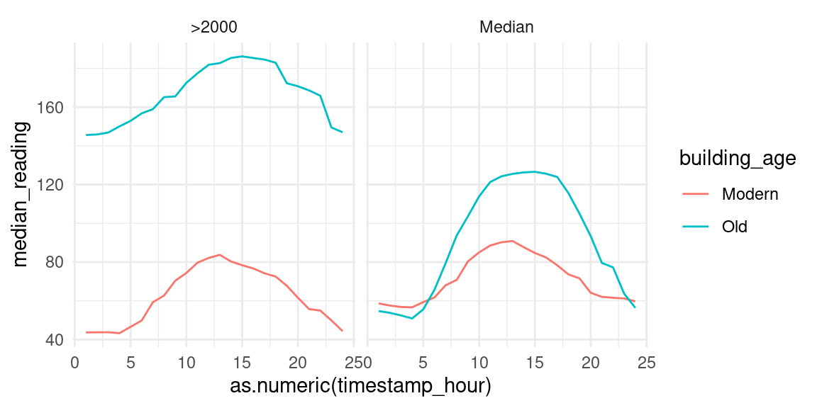
We clearly see on both facets that modern houses use less energy than old buildings In the left we see that energy usage increases dramatically around 1000 and decreases around 1400. This may imply that older buildings are less insulated than modern buildings, hence the need for heating the building throughout the day. We split the building age into decades below to further inspect the data.
data_subset <- data_subset %>%
  mutate(decade_built = as.factor(floor((year_built)/10)*10))

data_subset %>%
  filter(timestamp_month == "Jan") %>%
  select(decade_built, timestamp_hour, meter_reading) %>%
  filter(!is.na(decade_built), decade_built %in% seq(1950,2010,10)) %>%
  group_by(decade_built, timestamp_hour) %>%
  summarise(median_reading = median(meter_reading, na.rm=TRUE)) %>%
  ggplot(aes(x=as.numeric(timestamp_hour), y=median_reading, col=decade_built)) +
  geom_line()
## `summarise()` has grouped output by 'decade_built'. You can override using the
## `.groups` argument.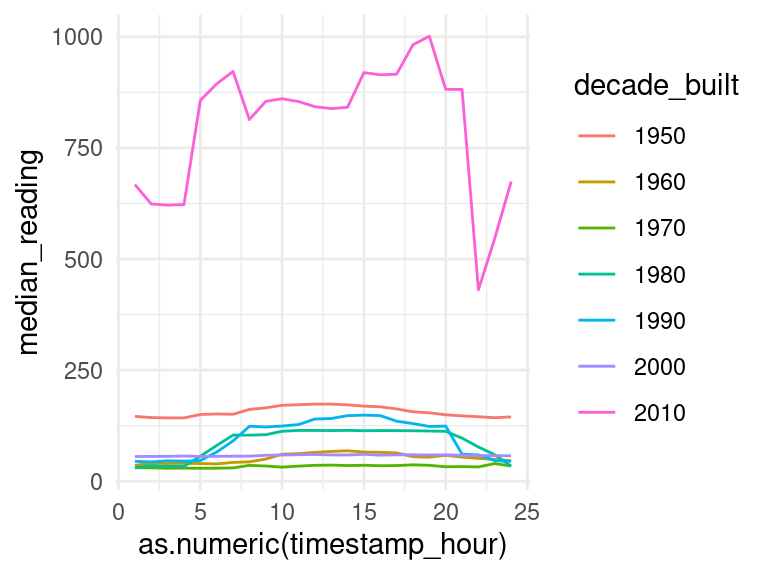
This isn’t exactly what we expected, but it’s likely that there are higher-dimensional relationships within the data which we simply cannot capture with a 2D graph. There are many more factors which impact the average meter reading.
We may be interested in the median readings of different types of meter.
data_subset$meter <- factor(data_subset$meter, levels = 0:3)

data_subset %>%
  group_by(meter) %>%
  ggplot(aes(x = log(meter_reading + 1), fill = meter)) +
  geom_density(alpha=0.4, adjust=1.5) +
  scale_fill_discrete()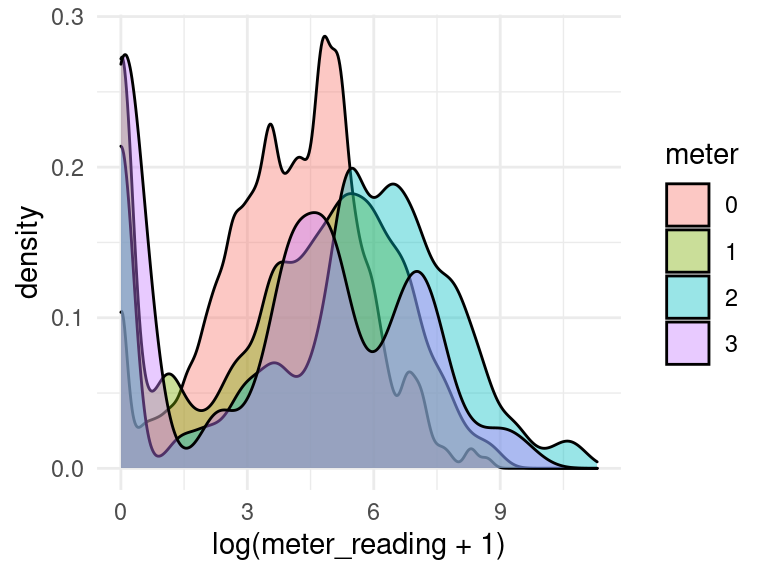
Let’s plot the median meter reading for each hour of the day.
data_subset %>%
  group_by(timestamp_hour) %>%
  summarise(median_meter_reading = median(meter_reading)) %>%
  ggplot(aes(x=timestamp_hour, y=median_meter_reading)) +
  geom_point() +
  geom_smooth()
## `geom_smooth()` using method = 'loess' and formula 'y ~ x'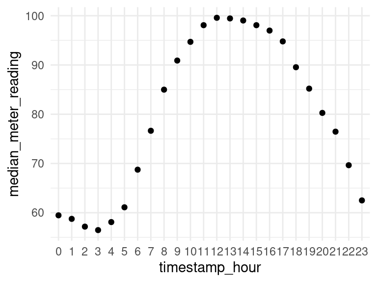
We may be interested in a plot of median meter readings for each type of building in primary_use.
data_subset %>%
  group_by(timestamp_hour, primary_use) %>%
  summarise(median_meter_reading = median(meter_reading)) %>%
  ggplot(aes(x = as.numeric(timestamp_hour), y = median_meter_reading)) +
  geom_line(colour = "skyblue") +
  facet_wrap(vars(primary_use), scales="free") +
  theme_minimal() +
  labs(title = "Median meter reading over the day",
       subtitle = "For different building uses",
       x = "Hour of the day", y = "Average median reading")
## `summarise()` has grouped output by 'timestamp_hour'. You can override using
## the `.groups` argument.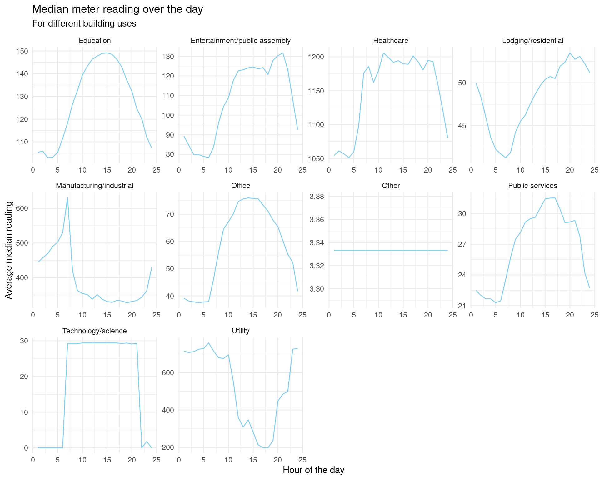
ggplot offers some nice tools for visualizing correlation matrices.
# get the correlation matrix
corrmat <- data_subset %>%
  select(-site_id) %>%
  select_if(is.numeric) %>%
  drop_na() %>%
  {round(cor(.),2)}

# melt into long format ready for ggplot2
corrlong <- melt(corrmat)
## Warning in type.convert.default(X[[i]], ...): 'as.is' should be specified by the
## caller; using TRUE
## Warning in type.convert.default(X[[i]], ...): 'as.is' should be specified by the
## caller; using TRUE# plot with ggplot2
plot1 <- corrlong %>%
ggplot(aes(x=X1, y=X2, fill = value)) +
geom_tile() +
labs(title = "Matrix of variable correlations", x = "", y = "") +
theme(axis.text.x = element_text(angle=90, hjust=1))
# plot only correlations with meter_reading
corrlong$X1 <- factor(corrlong$X1)
plot2 <- corrlong %>%
filter(X2 == "meter_reading") %>%
select(X1, value) %>%
as.data.frame() %>%
ggplot(aes(x = reorder(X1, value), y = value)) +
geom_col() +
coord_flip() +
labs(title = "Correlation of factors with meter reading",
x="", y="Correlation")
grid.arrange(plot1, plot2, ncol=2)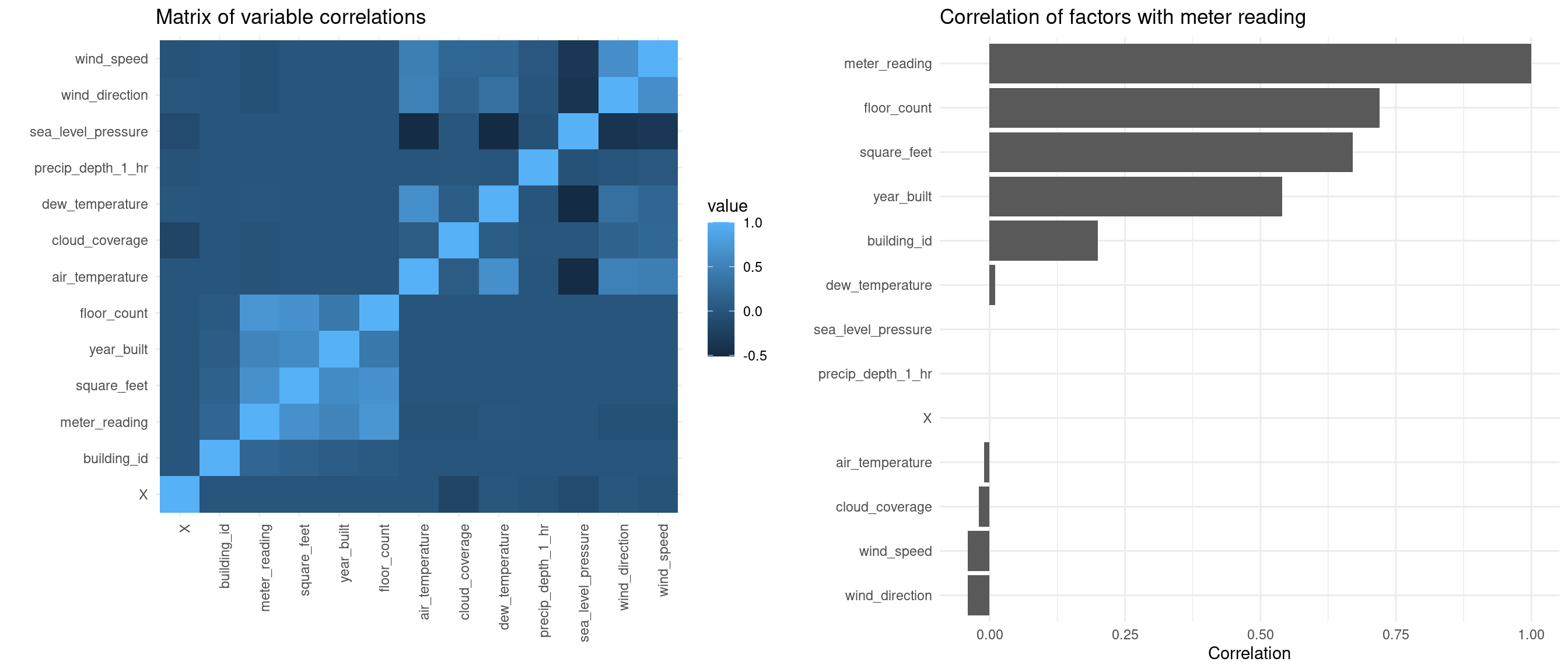
We are mostly interested in the factors which affect the meter reading. The above correlation matrix tells us that meter_reading is positively correlated with square_feet and floor_count. Let’s produce some plots to see the relationship.
data_subset %>%
  filter(square_feet <= 4e+05,
         timestamp_month == c("Jun")) %>%
  group_by(building_id, meter) %>%
  summarise(avg_meter_reading = median(meter_reading),
            square_feet = mean(square_feet)) %>%
  ggplot(aes(x=square_feet, y=avg_meter_reading)) +
  geom_point() +
  geom_smooth(method="glm") +
  labs(title = "Average meter readings in June",
       subtitle = "GLM overlaid in blue",
       y = "Average meter reading", x = "Square feet")
## `summarise()` has grouped output by 'building_id'. You can override using the
## `.groups` argument.
## `geom_smooth()` using formula 'y ~ x'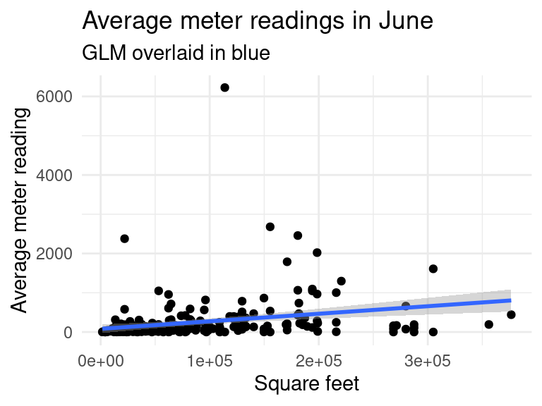
data_subset %>%
  filter(building_id != 685, building_id != 803, # remove outliers
         timestamp_month %in% c("Jun"), !is.na(floor_count)) %>%
  group_by(floor_count) %>%
  summarise(avg_meter_reading = median(meter_reading)) %>%
  ggplot(aes(x=floor_count, y=avg_meter_reading)) +
  geom_col() +
  labs(title = "Average meter readings in June",
       y = "Average meter reading", x = "Number of floors")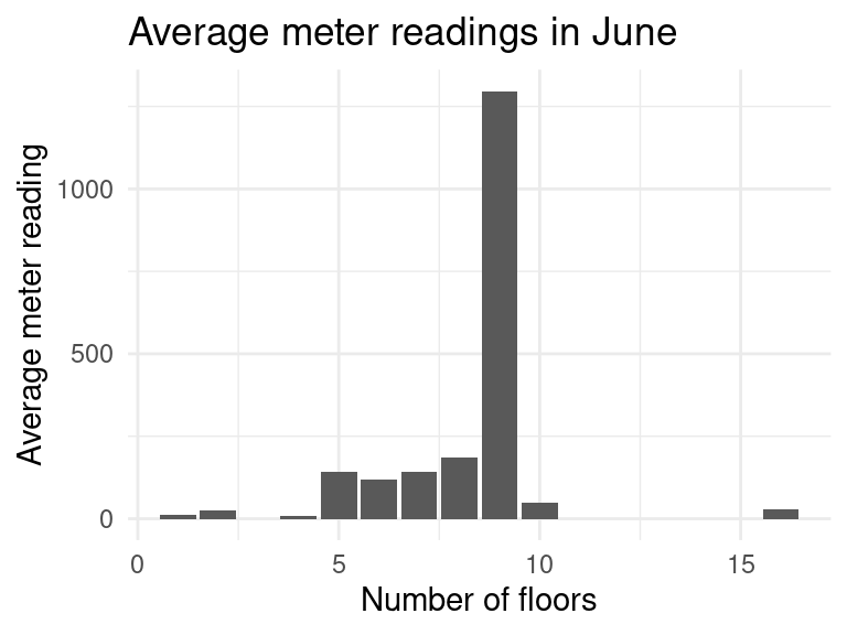
The graph seems to make sense. As the number of floors increases, the amount of energy needed to heat the building increases. There were some outliers which have to be removed such as the building with id \(685\) which has 5 floors and approximately \(250,000\) square feet! It uses much more energy than we would expect.